The Ultimate Guide to Response Web Design in Framer
A Comprehensive Guide for Beginners

By Cole
May 12, 2024
Introduction
Responsive web design ensures your website looks great on any device, from desktops to smartphones. With Framer, creating a responsive site is straightforward and efficient. Follow this guide to master responsive web design in Framer.
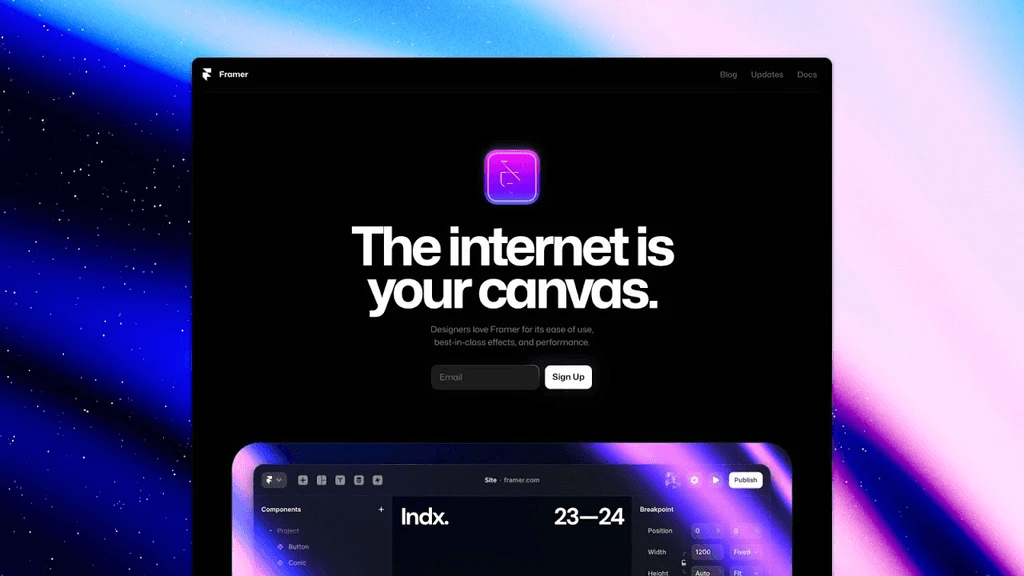
Step 1: Set Up Your Project (15 Minutes)
Sign Up and Log In:
Visit Framer's website, sign up, and log in.
Click "New Project" and select a blank canvas.
Familiarize with the Interface:
Canvas: Your main design area.
Layers Panel: Organizes your elements.
Properties Panel: Adjusts properties of selected items.
Toolbar: Tools for adding and editing elements.
Step 2: Design Your Base Layout (45 Minutes)
Create a Flexible Grid:
Use Framer’s layout tools to create a grid that adapts to different screen sizes.
Ensure elements are aligned and spaced consistently.
Design Key Sections:
Header: Add a logo and navigation links. Use the "Text" and "Image" tools.
Hero Section: Include a headline, subheadline, and a call-to-action (CTA) button.
Content Sections: Create sections for features, testimonials, and contact information.
Step 3: Make It Responsive (45 Minutes)
Use Auto Layout:
Apply auto layout to containers so they adjust automatically based on content size.
Set padding and margin to ensure consistent spacing.
Add Breakpoints:
In the Properties Panel, set breakpoints for different screen sizes (e.g., mobile, tablet, desktop).
Adjust the layout and elements for each breakpoint to ensure optimal display.
Responsive Typography:
Use relative units (e.g., em, rem) for font sizes.
Adjust font sizes and line heights for different breakpoints.
Step 4: Test and Refine (45 Minutes)
Preview Responsiveness:
Click "Preview" to see how your design looks on different devices.
Use Framer's device preview tool to switch between various screen sizes.
Make Adjustments:
Tweak layout, spacing, and font sizes based on the preview.
Ensure that images and videos resize correctly and maintain aspect ratios.
User Testing:
Share the preview link with colleagues or friends to get feedback.
Make final adjustments based on user feedback.
Step 5: Publish Your Responsive Site (15 Minutes)
Final Preview:
Do a final check to ensure all elements are responsive and look good on all devices.
Publish:
Click "Publish" to generate a shareable link.
Optionally, connect your custom domain for a professional appearance.
Conclusion
You've successfully created a responsive website using Framer! Responsive design ensures your site is accessible and visually appealing on any device. Keep exploring Framer's features to enhance your design skills further. Happy designing!